
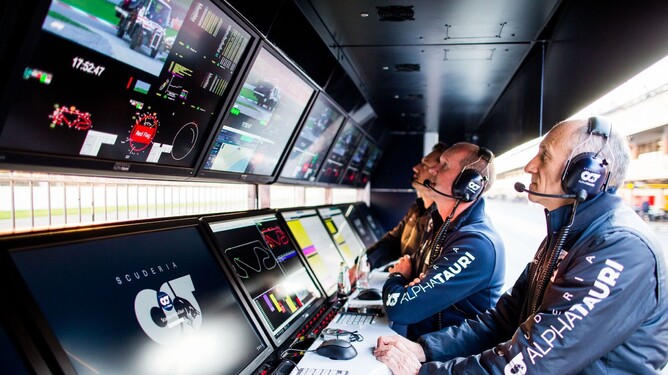
Keeping track of the relative position of all competitors in time and on the ground, is vital to understanding the strategy of any motorsport race. This is particularly true in longer format race events such as F1, Indycar and WEC.
In F1, teams have access to full race timing and GPS data and use various software tools to process, analyse and display this information. However, live lap times and positions give no context on how the race is panning out or how it may unfold in the future. For this, teams use gapper or race history plots, to try and gain a better understanding of F1 race strategy.
The anatomy of a gapper plot
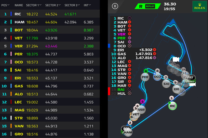
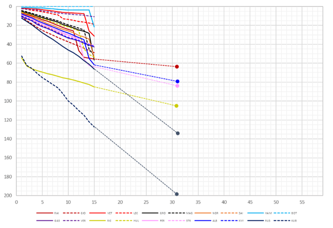
To understand what a gapper plot is and how it can be used, let's look at the example below. This shows the race history for the 2019 Australian grand prix which was won by Valtteri Bottas for Mercedes.

1. Time axis
This gives the relative position of each car, in time, to a given zero. This zero can be worked out in a number of ways. In this example, it is relative to the winner’s average race lap time, in other cases it might be relative to a specific car or to the leader.
2. Lap axis
Tracks the relative time progression throughout the race.
3. Individual driver information
Each driver is colour coded by team and then identified by a dashed or solid line.
4. Pit stops
Displaying times relative to an average race lap time allows pit stops to be easily identified. The large time loss in the pit lane shows up as a clear step in each driver’s timing data.
5. Relative pace
The gapper graph also makes it easy to judge the relative pace between cars. At point 5, Ricciardo’s Renault has just cleared Kubica’s Williams after both visited the pits due to a first lap incident. The slope of Ricciardo's data is downwards, highlighting that his pace is slower than the winner’s average lap times. However, it is much less steep than Kubica behind and Russell ahead, showing he is quicker than both Williams.
6. Lapped cars
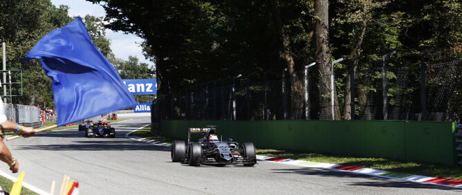
Time differences don’t tell the whole story once the leaders are lapping other cars. The data in grey is effectively a repeat of the coloured data, but a lap behind. A good example is at position 4; the two Williams are a lap apart but running together and matching each other’s pace. The grey data also explains slow laps; where a leader’s grey line crosses a coloured line, the latter has been lapped and was probably shown blue flags.
Taking a lap slice
Another useful plot comes from a vertical slice of data taken on a given lap, which shows the instantaneous relative time gaps. These become particularly useful around the pit stop windows for each car.
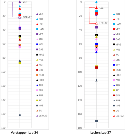
These charts show the lap before the pitstops for two drivers: lap 24 for Verstappen (left) and lap 27 for Leclerc (right). Each car is represented by a coloured point, plotted against their time gap to the leader on the y-axis. For cars of interest, there is an extra point which shows the expected position after a pit stop. The teams carefully estimate the pit loss time which is generally 20-25 seconds depending on the track layout.
Example 1: Verstappen’s lap 24 problem
On lap 24, Verstappen is leading the race and Bottas is in second. Bottas pitted on lap 22 and his fresher tyres mean that Verstappen is losing time to the undercut, so Verstappen should pit to minimise the loss. However, the instantaneous gapper shows that stopping now will drop Verstappen directly behind Hamilton and Vettel, who pitted much earlier. Losing track position like this can ruin Verstappen's race if he can’t re-pass the cars ahead.
The race strategists have a choice. Assuming there is tyre life remaining, Verstappen can either stay out and attempt to increase the gap so that when he pits he comes out ahead of Hamilton. Alternatively, he can stop and hope his newer tyres allow him to clear the two cars. As shown below, Verstappen pits and drops behind them. He clears Vettel after five laps, but follows Hamilton closely for the rest of the race costing him P2.
Example 2: Leclerc’s lap 27 planning
On lap 27, Leclerc is running alone and if he pits now, he will drop into the same gap as Verstappen. However, there’s a crucial difference as Leclerc will drop out just ahead of Gasly in the other Red Bull with clear air ahead. The pit wall can monitor the relative pace of Leclerc, Gasly and Verstappen to plan the pit stop to maximise the time he can run alone at his own pace.
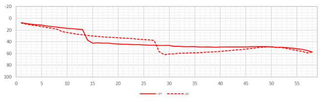
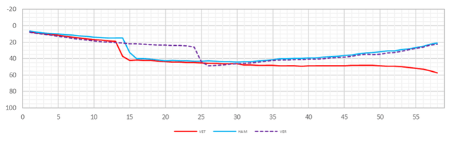
Pitting on lap 27 works well for Leclerc and afterwards, his pace is good enough to catch his teammate. Notice the contrast between the upwards slope of Leclerc's line and the level slope for Vettel. The lines meet at lap 49 and Leclerc has caught Vettel, but then… nothing.
Rather than allow Leclerc to pass Vettel, Ferrari hold station and Leclerc remains behind Vettel. Both cars end up at Vettel’s ever slowing pace as he pays the price for an early pit stop. From a team’s perspective, they score the same points either way, but this situation is frustrating for Leclerc who lost out on fourth place.
The importance of backmarkers
When working for a team at the back half of the grid, all the same strategy analysis and planning has to be carried out as the top teams, but there is an extra dimension. As well as managing the gap backwards for their own pit stop window, engineers also have to look forwards to watch cars dropping back as a result of a pit stop. This can create traffic, blue flags and significantly affect a driver's race. That's why some teams will choose to stop pre-emptively to try and prevent this from happening.
Simulation and reality
The examples above demonstrate how much a gapper plot can tell you about a race and how well they distil a lot of information into a single chart. They are so useful that they are often the default way of showing the outcomes of strategy predictions as well as actual races.
F1 teams will simulate around 300 million permutations of the race, often using the Monte Carlo method, to try to predict outcomes of races. These are based on as much information as possible about pace, differences between drivers, tyre choices, tyre degradation and many other things. Important simulation results, usually ones that have markedly different outcomes, will be viewed and presented using gapper plots.
They may also take completed race histories and try to predict the outcome of different decisions. In the Leclerc/Vettel scenario, they may produce a version that estimates whether Leclerc could have caught Verstappen had team orders been applied. They will use this to make planning changes for future events.
Live races
So far we have concentrated on data for completed races or simulations. However, during a race weekend, teams use live-streamed timing data to update these gapper plots as the data comes in. This can help strategists judge the likelihood of traffic, either from catching (or being caught by) the cars they are racing or from lapped backmarkers.
Here, the cars of interest have forecast lines that attempt to judge where they will be in a few laps time. We’ve removed most of the forecasts for clarity and kept those for cars directly around Ricciardo. The forecasts are usually based on some lap time averaging of previous laps, but could be much more sophisticated to try to account for strategy. Here we can see Ricciardo should catch Russell around lap 21, although it was actually lap 25.
Now that we have seen how useful these plots can be to determining Formula 1 strategy, find out how to build your own race strategy gapper tool from freely available data sources.

Former Senior Performance Engineer
Williams Racing F1