

In our previous blog, we discussed how teams analyse F1 race strategy using race history or gapper plots. In this article we will explain how to build your very own gapper tool using Excel. This will allow you to create a gapper plot for any F1 race, so you can analyse different strategies and practice your race strategy skills.
Step 1: Data sources
As a student or a fan, access to live timing data can be hard to come by. In F1, it is streamed to the teams and to the F1 app, for those that subscribe. Fortunately, there are many sources of timing data that we can use instead.
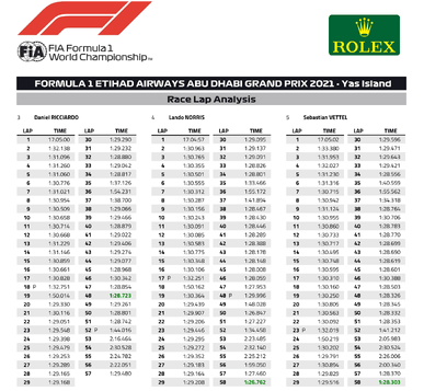
The FIA publish basic lap timing data for every F1 race weekend in PDF format on their website. For example, the data for the 2021 Abu Dhabi GP can be found here. This isn’t at the level of detail issued to teams, which includes full sector time and speed trap data, but it is more than adequate for developing a gapper tool.
F1 is not the only series to publish timing in this way. BTCC and British GT (and their support series) publish all of their timing via TSL Timing. Similarly, Alkamel publish World Endurance Championship timing, among other championships.
Step 2: Importing data into Excel
We’ll use Excel because most people have access to it and it’s remarkably powerful. The bespoke software tools used by F1 teams are great, but they carry a huge overhead in cost, software writing and maintenance.
There are two timing PDFs we need: 1) The overall race classification 2) The race lap analysis. For this example we'll use the data from the 2019 Australian grand prix. A disclaimer here, this timing data is copyrighted by the FIA/FOM other than for journalistic use.
Most of the work is done using the race lap timing analysis document. Getting the text from this into Excel is straightforward. First, open the document in Adobe Acrobat Reader, select all (Ctrl A), copy and then paste into an Excel worksheet. This will give a list of text giving each lap time for each driver, as shown below.
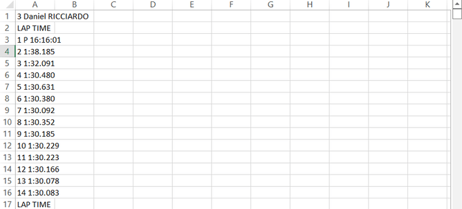
There are many ways to convert this into a more useable format. 'Text to Columns' helps to split out the items in each line, you can write a VBA macro to do it more neatly or just manually type the data in.
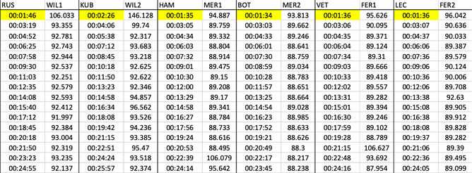
Step 3: Processing the data
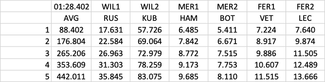
Ultimately, the aim is to have a set of data for each driver with lap-by-lap times and cumulative race time. In the example below, there are two columns of data per driver, the lap times are in the right-hand column and the cumulative race times are in the left.
However, there is a quirk in the race lap analysis document which means there is no first lap time given. We can calculate this by summing all of the other lap times given for each driver and then subtracting the total from the overall race time given in the overall classification document. These times are highlighted in yellow.
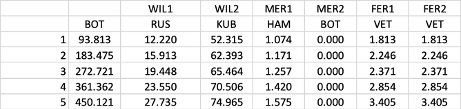
Step 4: Plotting the data
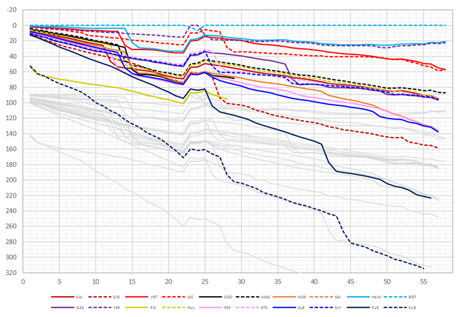
Once the data is neatly compiled, you can do almost anything with it. For our purposes, we want to create a gapper plot and this means comparing the total race times to something. The most straightforward comparison is to a given car, such as the winner, which in this case was Valterri Bottas. For this, you simply subtract the desired car’s cumulative race times from all of the others and create the plot, as shown below.
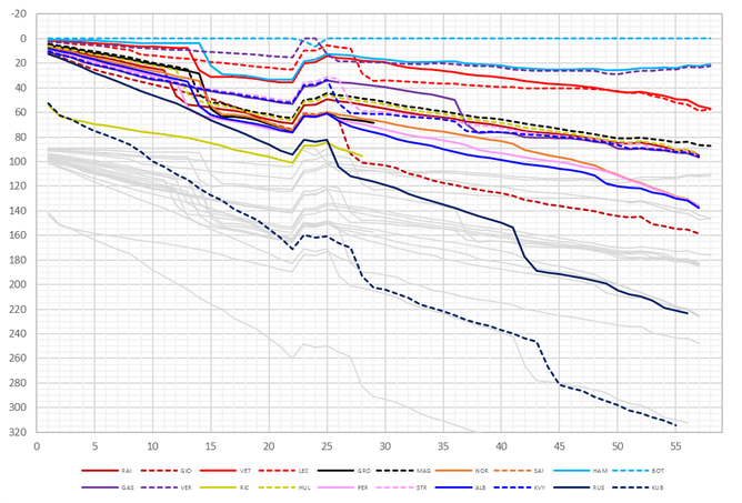
This works equally well for any driver. It’s usual for a team to look at the race for each of its drivers individually when discussing how their races worked out. For example, for Gasly the race looked like this:
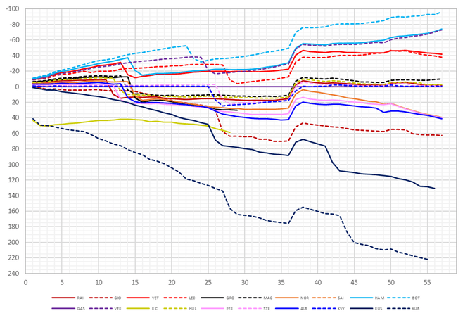
More normally, you can create a column of data representing the winner’s average lap time to use as the comparison, which is easy to do. First, take the winner’s race time and divide it by the number of race laps to get an average lap time and then sum this lap-by-lap. This is how the other gappers in this article are plotted.
Alternatively, you can select the first car to start each lap as the reference, by simply using the MIN command across each row. There are a lot of possibilities for you to try so feel free to experiment.
The rest of the display is about colour coding and formatting. Once you have a working spreadsheet, you can create buttons and macros or write VBA code to do a lot of the heavy lifting for you. This is particularly useful at the start of a new season if there are team and driver changes to account for.
Creating the single lap displays to look at pit stop timing involves simply plotting a single row of the data in the table. Adding the greyed-out ghost data for the lapped cars requires a little more data manipulation, so why not try and see if you can do it for yourself.
Interested in learning more about race strategy? Then join our online module on 28 January 2023!

Former Senior Performance Engineer Williams Racing F1